 |
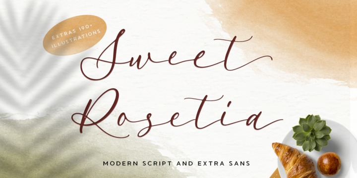
Sweet Rosetia font family consists of a script, a sans style and a set of dingbats.
The handwritten modern script works perfectly together with the sans serif and 190+ cute illustrations. Sweet Rosetia Script includes a full set of lowercase letters with beginning swashes , a full set of lowercase letters with ending swashes, contextual alternates, stylistic alternates and ligatures features that makes the font look more natural.
Sweet Rosetia is perfect in designs such as logotypes, brand, magazines, websites or blog headlines, packaging, branding, quotes, invitation cards, greeting cards, business cards, wedding invites, and more.
Sweet Rosetia Includes:
- Ligatures, Contextual alternates, Stylistic alternates, and Swash (Beginning and Ending Swashes)
Uppercase, lowercase, numeral and punctuation
- Sweet Rosetia Regular and Sweet Rosetia Sans
- 190+ cute illustrations
- PUA Encoded Characters
- Fully accessible without additional design software
- Multilingual support for English, French, Italian, Spanish, Portuguese, German, Swedish, Norwegian, Danish, Dutch, Finnish, Indonesian, Malay, Hungarian, Polish, Croatian, Turkish, Romanian, Czech, Latvian, Lithuanian, Slovak, Slovenian.
How to get access alternate glyphs with designing software to OpenType fonts, check this link : http: //adobe.ly/1m1fn4Y