 |
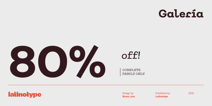
Galería is a monoline slab serif typeface inspired by world contemporary art gallery buildings, museums and cultural centers where organic forms and straight lines predominate.
Galería combines functionality of a slab serif with the distinctive appearance of monospaced fonts—exaggerated serifs, wide proportions, distinguishing characters, contrasting geometric shapes and lengthened terminals. This combination resulted in a dynamic and pregnant typeface, yet legible and functional, well-suited to museographic and editorial projects, corporate use, and strong brand identity design such as posters, logotypes and packaging.
Galería consists of a standard and an alternative version, each in 8 weights—ranging from Thin to Black—with matching italics. The font also includes OpenType features, like discretionary ligatures, and the whole 464-character set supports more than 200 Latin-based languages.