 |
A circa-1920s book on lettering entitled “Book of Alphabets” by Regan Publishing displayed an example of a Grotesk typeface (a popular style of sans serif of the time).
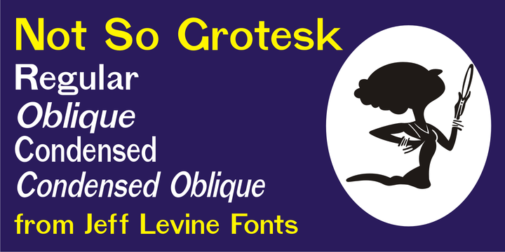
This design was re-drawn digitally as Not So Grotesk JNL and is available in four varieties - regular, oblique, condensed and condensed oblique.
Not So Grotesk JNL is the perfect companion font family to use alongside Simply Grotesk JNL.